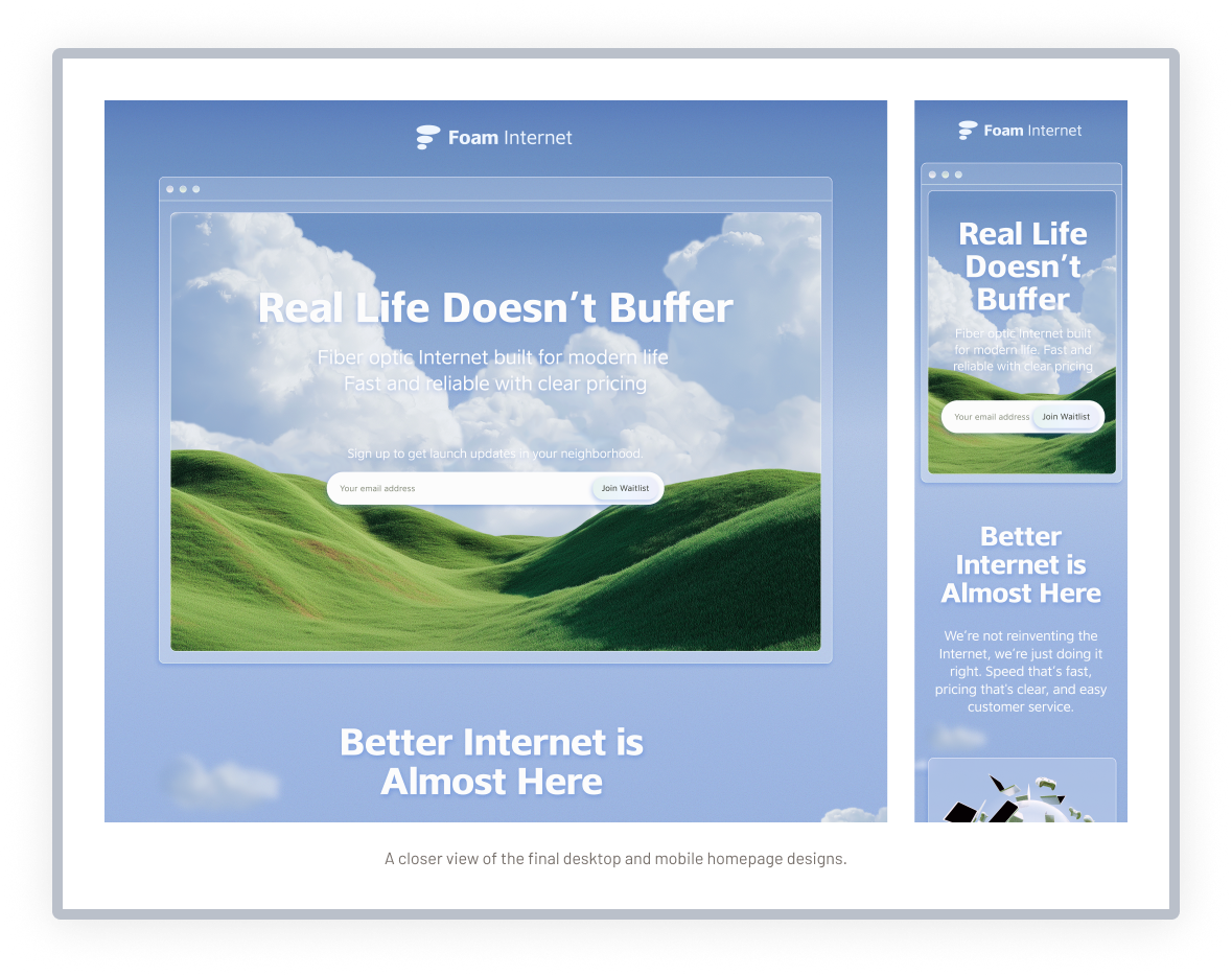
The initial designer established an expressive direction built around open skies, dimensional imagery, glass treatments, and playful movement. The concept already had a distinct personality and a strong foundation to build from.
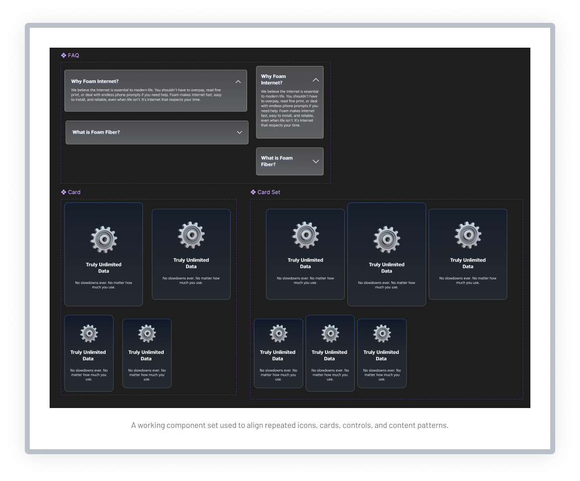
As the homepage expanded, similar elements began using different typography, spacing, visual treatments, and responsive behavior. Interaction ideas had also been discussed, but much of the movement still needed to be defined clearly enough for implementation.
Established visual direction
The initial design introduced the atmospheric imagery, soft glass effects, and expressive tone that defined the experience.
Early motion ideas
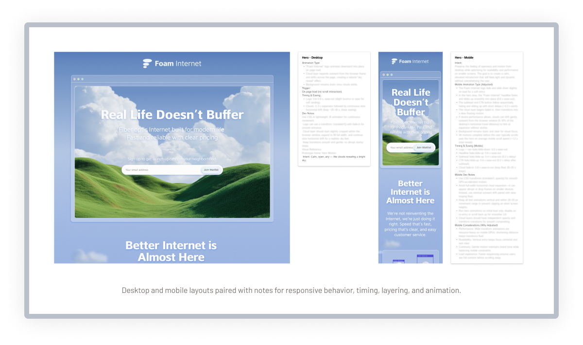
The client shared ideas for movement, but interactions had not yet been fully designed or prototyped.
Evolving client requests
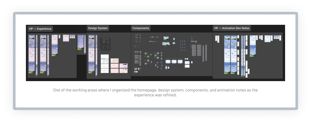
New ideas and additions continued entering the project, increasing the need for consistency across the page.
Responsive gaps
The desktop direction was further developed than the mobile experience, requiring decisions about how the visual system would adapt.