ECOMMERCE · RESPONSIVE UX · DESIGN SYSTEMS · PRODUCT CONFIGURATION

A Unified Luxury Ecommerce System

Role
UX & Product Designer
Date
2025
Company
DMF Luxury through AllGoud
Scope
Ecommerce, product configuration, navigation, cart, saved projects, customer accounts, dealer experiences, editorial templates, emails, design systems, and handoff
Tools
Figma, CSS
DMF Luxury was redesigning a broad digital ecosystem spanning product discovery, configurable lighting products, customer accounts, dealer tools, editorial content, and supporting communications.

I joined the project expecting to prepare the existing designs for development handoff. As I worked through the files, it became clear that the experience needed deeper standardization, additional responsive and interaction decisions, and several entirely new pages before it could function as one connected product.
Challenges
The project already had a sophisticated luxury identity, but its visual and interaction patterns had not been applied consistently across the larger experience. As the client identified additional needs, the system also had to support new pages and workflows without losing the established look and feel.

What I Inherited

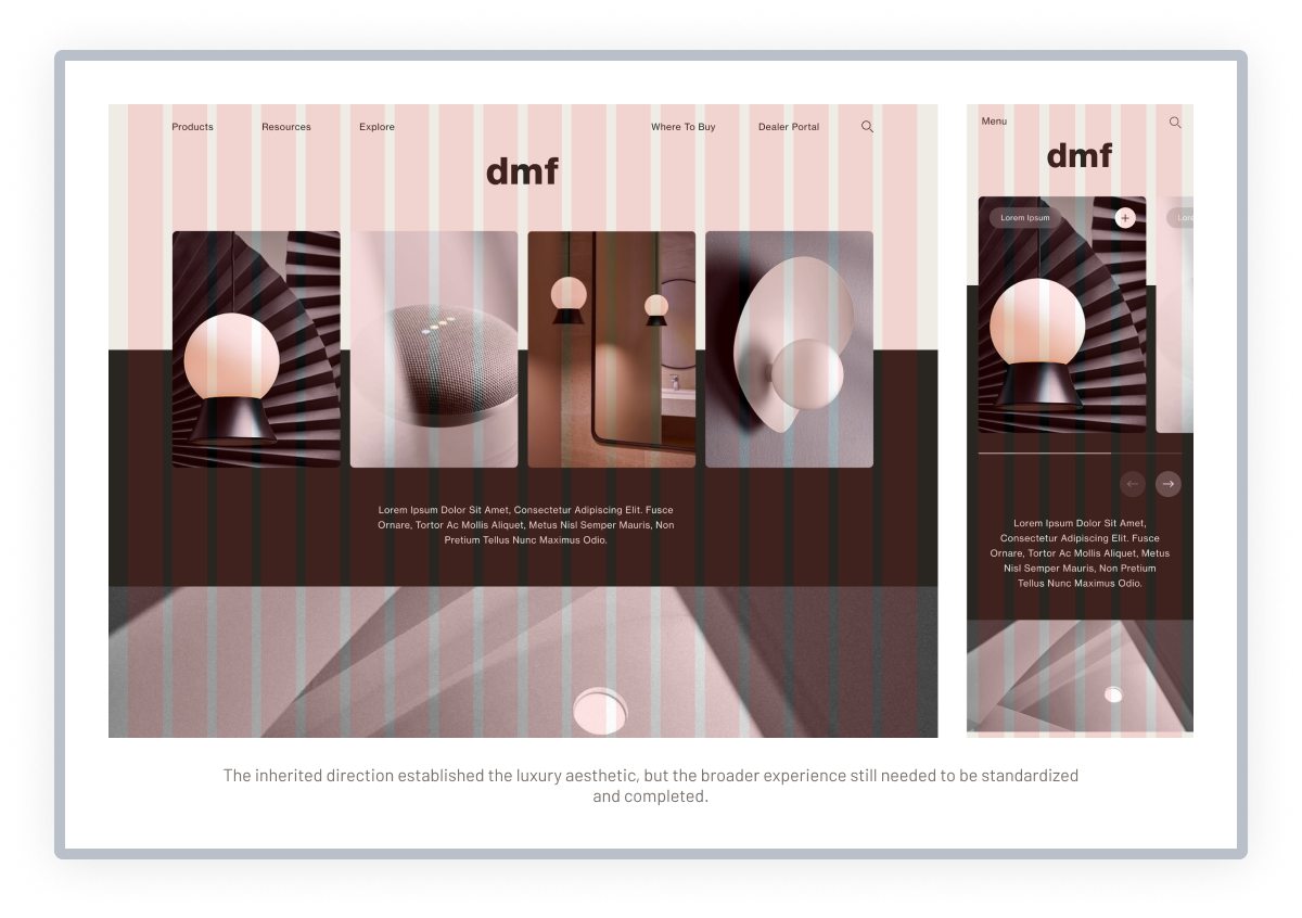
The project already had a refined visual identity built around architectural imagery, warm neutral colors, restrained typography, and an elevated editorial feel. A broad collection of homepage, product, ecommerce, and supporting page concepts had already been created.
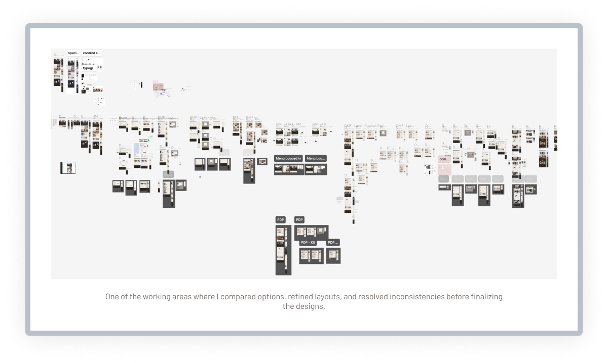
However, repeated elements were handled differently across the files, responsive behavior was incomplete, and several interactions still needed to be resolved. What appeared to be a handoff task was actually a larger effort to turn an established design direction into a consistent system that could support both the existing screens and the client’s expanding needs.
Established luxury direction
The existing designs created a sophisticated luxury direction using architectural imagery, warm neutrals, and editorial typography.
INCONSISTENT SYSTEM
Typography, spacing, navigation, controls, inputs, and repeated page patterns varied across related experiences.
INCOMPLETE BEHAVIOR
Several responsive layouts, interaction states, and logged-in workflows still needed additional design decisions.
EXPANDING CLIENT NEEDS
The client identified new pages and functionality during the project, requiring the visual language to support more than the original concepts.

What I Contributed

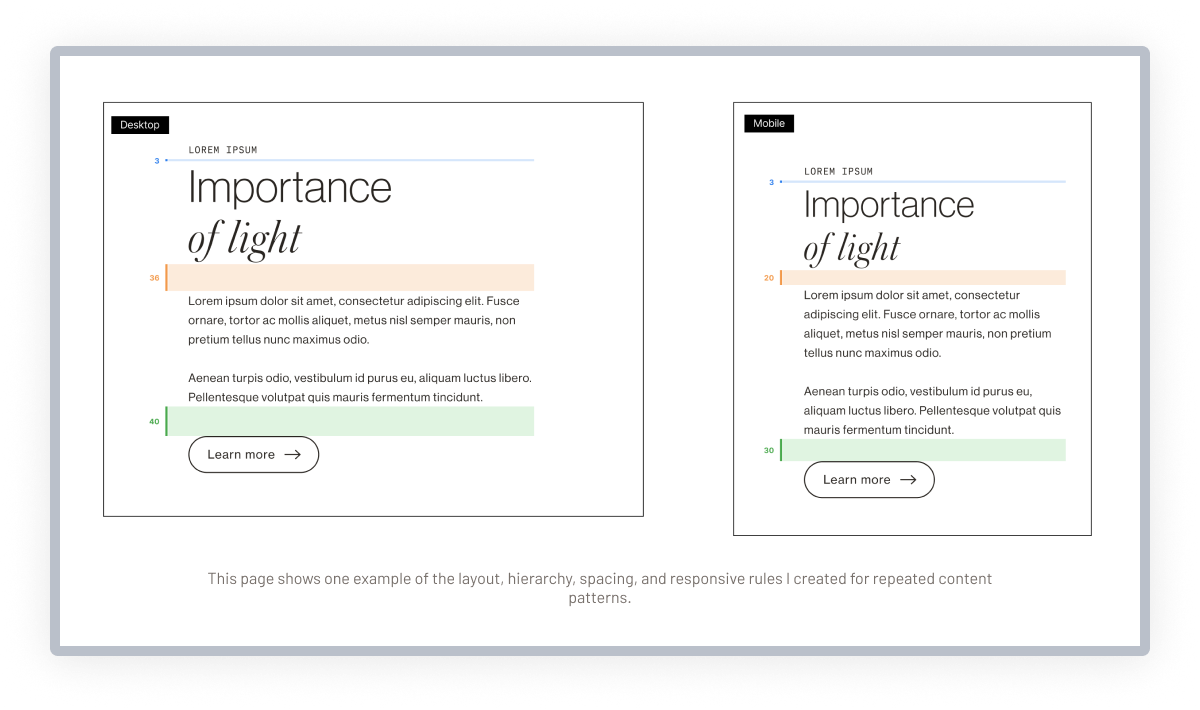
I translated the established visual direction into a more repeatable system, defining shared rules for typography, colors, buttons, inputs, navigation, spacing, content layouts, and responsive behavior. I applied those decisions across the existing ecommerce, account, dealer, and product experiences to make the broader system feel consistent.
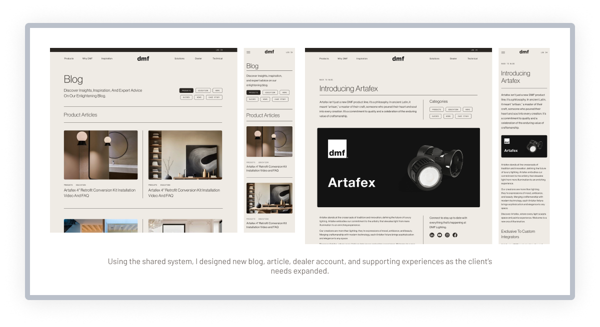
As the client’s needs expanded, I also used those shared patterns to create additional pages and workflows, including dealer access and editorial experiences such as the blog and news templates. This allowed new functionality to feel native to the original design rather than added on later.
Visual standardization
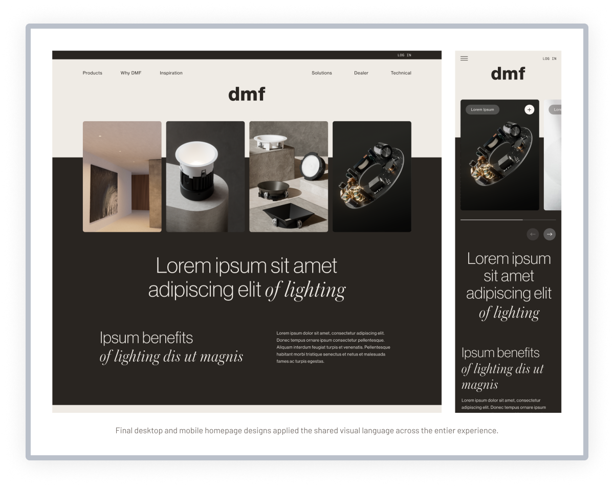
I aligned typography, spacing, visual treatments, and repeated patterns so the homepage felt like one connected experience.
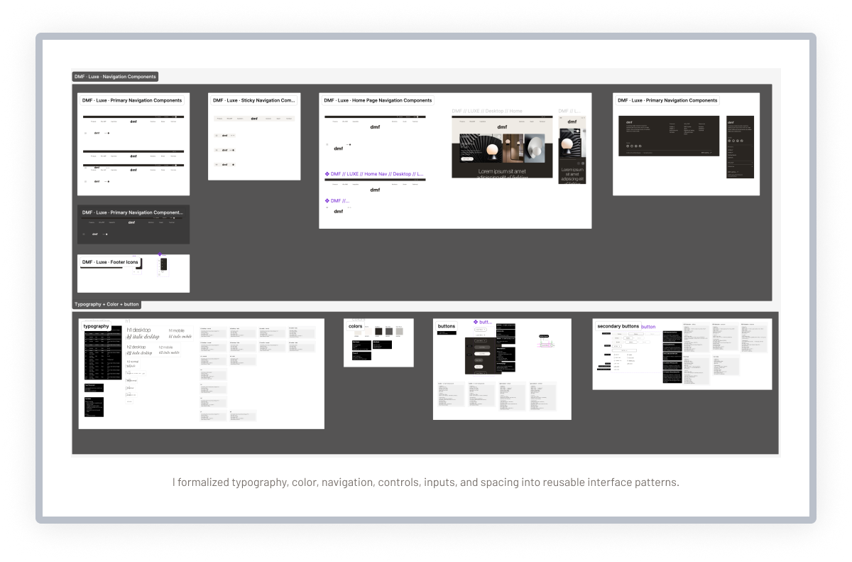
SYSTEMIZED THE VISUAL LANGUAGE
I created consistent typography, color, spacing, navigation, input, button, and layout patterns based on the established design direction.
COMPLETED RESPONSIVE EXPERIENCES
I aligned desktop and mobile behavior across ecommerce, product, account, dealer, and supporting page types.
DESIGNED NEW EXPERIENCES
I used the emerging system to design new pages and workflows, including dealer login, registration, representative discovery, blogs, and articles.
PREPARED THE WORK FOR DEVELOPMENT
I resolved missing states, aligned related screens, and completed the specifications needed for a clearer development handoff.

What Shipped

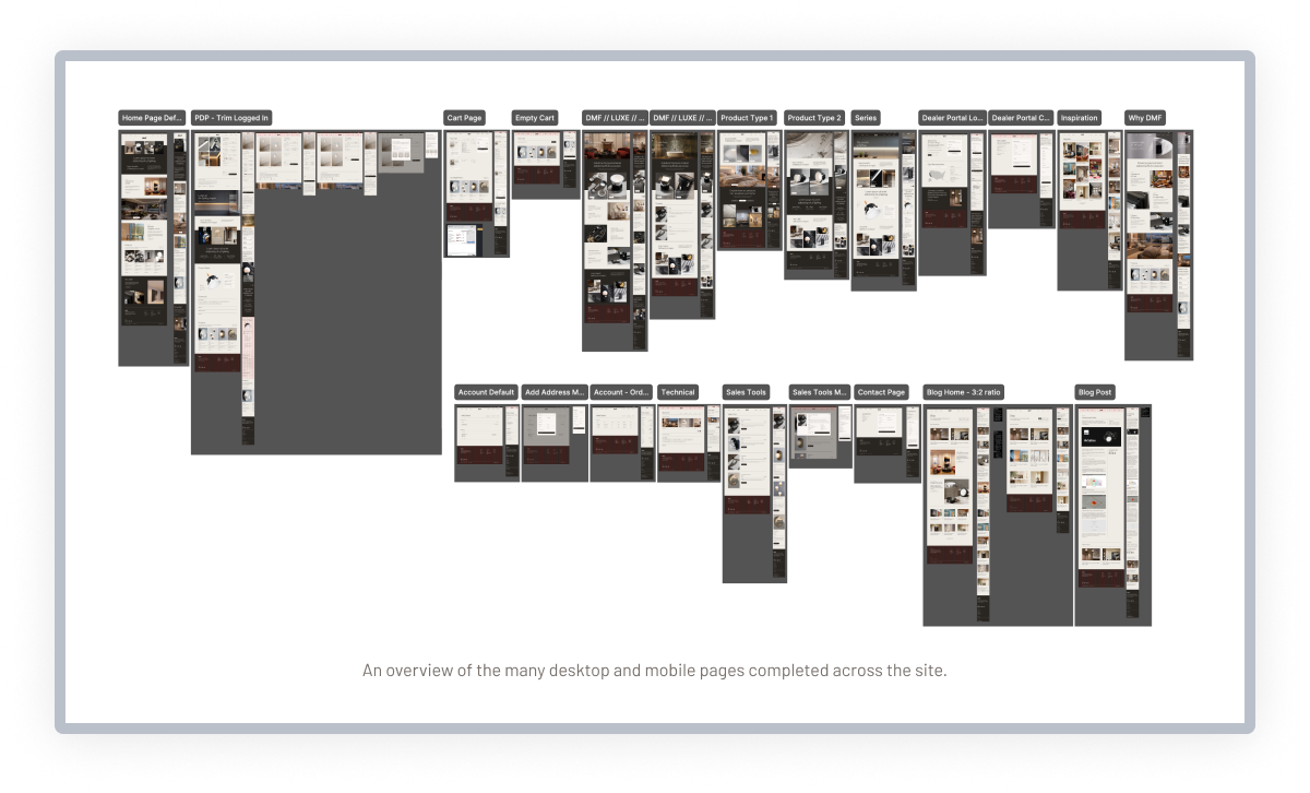
The final design package included a responsive ecommerce ecosystem spanning marketing content, product discovery, configurable product pages, cart and saved-project tools, customer accounts, dealer experiences, editorial content, email designs, and reusable interface patterns.
The shared system connected both the original designs and the newly created pages, giving the development team a more complete and consistent set of experiences to implement.
COMMERCE AND PRODUCT EXPERIENCE
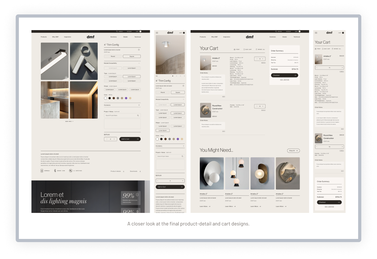
Responsive homepages, navigation, product discovery, configurable product pages, cart behavior, and saved-project tools supported the core ecommerce journey.
CUSTOMER AND DEALER WORKFLOWS
Account details, addresses, order history, dealer login, registration, and representative discovery supported logged-in and professional users.
EDITORIAL AND COMMUNICATIONS
Blog pages, news and article templates, and email designs extended the visual identity into education and supporting communication.
REUSABLE INTERFACE SYSTEM
Shared navigation, controls, inputs, typography, spacing, and responsive rules connected the larger experience into one product language.

Delivery Impact

The work turned a broad collection of visually strong concepts into a more unified and development-ready product system.
Standardizing the core patterns made it possible to complete existing workflows and add new dealer, editorial, and supporting experiences without fragmenting the established luxury identity.
ONE CONNECTED PRODUCT LANGUAGE
Customer, dealer, ecommerce, account, and editorial experiences followed shared visual and interaction rules.
Responsive behavior defined
The reusable system supported new pages and functionality without requiring each addition to begin from scratch.
CLEARER DEVELOPMENT DIRECTION
Completed states, responsive rules, and consistent components reduced ambiguity during handoff.
A strong visual identity becomes more valuable when it can grow. By turning the existing direction into a shared system, I could complete the original experience and create new pages without losing what made the design distinctive.

More Case Studies